From Amazon to Apple: how a brand’s logo changes
“The power of symbols should not be underestimated; if a logo fails to communicate what the company stands for, it is a wasted opportunity.”
This was written by Philp Kotler, the father of modern marketing, in his book
B2B Brand Management
. A maxim still underlying the strategy that defines a brand’s logo today.
Many of the most famous brands began with logos that poorly represented their reality, in part because they were influenced by the fashion of the time still linked to the Art Nouveau style.
All, however, have since returned to the “straight and narrow,” some sooner, some later, by having ad hoc logos created that were simple, immediate, and easily recognizable even when printed in small formats.
How does a brand logo change?
Here are some of the logos that, before they made history, had an evolution all their own!
Amazon
An A with a road in the middle. This was the logo of one of the brands that would climb to the top of the global market 20 years later, but at the time was only in the business of selling books.
When Jeff Bezos decided to give his company a radical makeover, the logo was also changed to the iconic shape we all know today.
Amazon’s logo has become purely textual and shows how from the single “A” you can get to “Z,” thus emphasizing that in e-commerce you can find literally anything.
The arrow itself takes advantage of the human tendency to almost automatically recognize faces in inanimate objects. The logo is designed to resemble a smile, thus conveying the feeling of being somehow “positive” and “friendly.”

Apple
There are so many myths behind the creation of the Apple logo. From the discovery of Isaac Newton to the Beatles‘ cover, to a tribute to Turing, the creator of the first computer, who committed suicide by biting into an apple dipped in cyanide.
Many believe the first version, also depicted in the brand’s very first logo: a carving of Newton under the apple tree where he is said to have been inspired to discover the law of universal gravitation.
The logo, created in the 1970s, was very elaborate and richly detailed and contained the brand name(Apple Computer Co.), which proved difficult to reproduce, however.
Thus, the bitten apple seems to have been born, relatable to the biblical story of the forbidden fruit and thus a symbol of desire, irreverence, rebellion but also of discovery and knowledge.
Instead, the first apple, in a rainbow version, highlighted the Apple II’s ability to present color images and made the company’s products more “humanized.”
Canon
How can you explain the superiority of your product to customers in a simple and straightforward way? Simple, Canon thought: associate him with a deity.
We refer in particular to
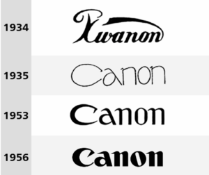
Kwannon
, a Buddhist deity with a hundred arms, who was the inspiration for the choice of the Japanese brand name(Kwanon) and the brand’s first logo.
Then, over time, not only the name changed (from Kwanon to Canon), but also the font and color, which changed from black to red and still identifies the brand.

Toblerone
Toblerone is a very famous Swiss chocolate brand.
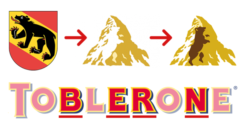
Also because of this, not everyone will have immediately noticed the presence of a bear exactly in the center of this triangular figure.
The choice of this animal as the brand’s logo is actually a tribute to the city where the company was born, namely Bern.
The word Bern (in German), in addition to also being contained in the product name, is known precisely as the “city of bears.”

Toyota
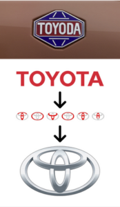
No, Toyota has not always called itself that.
Originally, its name was“Toyoda,” later changed both as a matter of sonority and because Toyoda, in Japanese, is spelled with ten strokes of the brush while Toyota requires only eight. Number that, in Japan, is associated with luck.
Currently, the brand logo takes up the shape of the steering wheel. An outer circle represents the world that embraces Toyota, as well as containing all the letters that make up the name.


